The Product

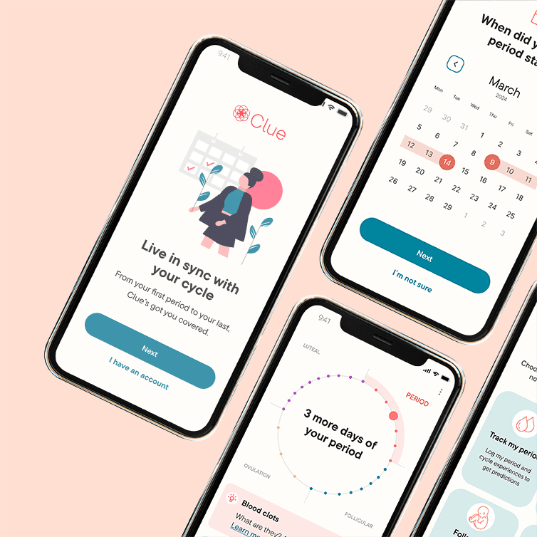
For this project, I focused on Clue, a period tracker I use myself. Clue is much more than that, but despite its regular use, it took some time for me to fully grasp its capabilities. As a UX designer, I saw an opportunity to apply UX and UI design principles and improve Clue’s Onboarding process

Project Duration

Clue is an app dedicated to people that want to track their period, fertility and learn more about how their bodies work.

Project Duration

February - April 2024

My Role

UX and UI, from wireframing to prototyping of the Onboarding screens.

Responsibilities

Competitive audit, user research, low
and high-fidelity prototyping, usability studies, and iterating on designs.

Project showcase laptop mockup

01

First Analysis

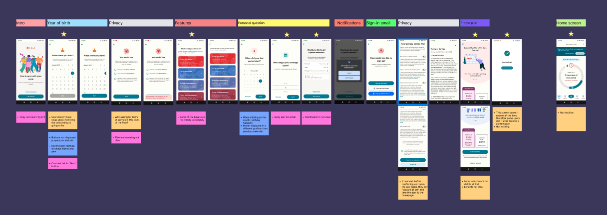
  • Not all features are fully visible, users need to scroll

  • Once clicked on a feature, even if by mistake, users are taken to the next step

  • The background color of some boxes doesn't follow  WCAG standards

My initial thoughts:

That makes little sense.

  • All boxes are visible and copy is more readable

  • Icons support users in understanding what the features are about

  • An extra confirmation step has been added, to show the users what has been selected before proceeding

The outcome of the research study:

No one needs that.


My initial thoughts:

That doesn’t make any sense.

But who am I to judge AI? Maybe I’m biased. Everyone is.
So I put aside my +9 years of experience in the design field and my +5 years of studies in Art and took the prompt very seriously.
Like, conducting a competitive audit and defining 2 users' personas.
Like spending 3 weeks interviewing strangers. 


The outcome of the research study?

No one needs that.

My initial thoughts:

That makes little sense.

But who am I to judge AI? Maybe I’m biased. Everyone is.
So I put aside my +9 years of experience in the design field and my +5 years of studies in Art and took the prompt very seriously. Like, conducting a competitive audit and defining 2 users' personas. Like spending 3 weeks interviewing strangers. 


The outcome of the research study?

No one needs that.

What does that show us?

What does that show us?

My research was biased

I could have a career as fortune teller

Nevertheless, I started all over again. A new time-draining yet enlightening user research, a new user persona, a new problem statement, to then focus on a new journey map of course. Here's the new prompt which I worked on:

The Problem


People living in Berlin often don’t know which art-related event to attend due to the abundance of exhibitions taking place, and at the same time, artists do not have enough visibility outside the art scene or social media.

User research: pain points

1.   Abundance of exhibitions occurring at the same time and insecurity on which one to choose
2.   Distribution of offers scattered over multiple platforms
3.   Lack of info on how to support local artist (as many users express their interest in doing so)

The Goal


Design an app to connect artists and art lovers living in Berlin, offering a selection of art-related events and new occasions of interaction between them.

02

Wireframing

  • Onboarding progress duration unclear

  • User flow interrupted for consent solicitation

  • Post-onboarding confirmation lacks consistency

  • Premium account benefits poorly displayed on the promo page

  • Home screen prioritizes promo banner over tracker tool

Im confused but I agree

I wholehearedly agree

Project showcase laptop mockup

Beginning of hardcore
iteration phase on Figma

Beginning of hardcore
iteration phase on Figma

03

Prototyping

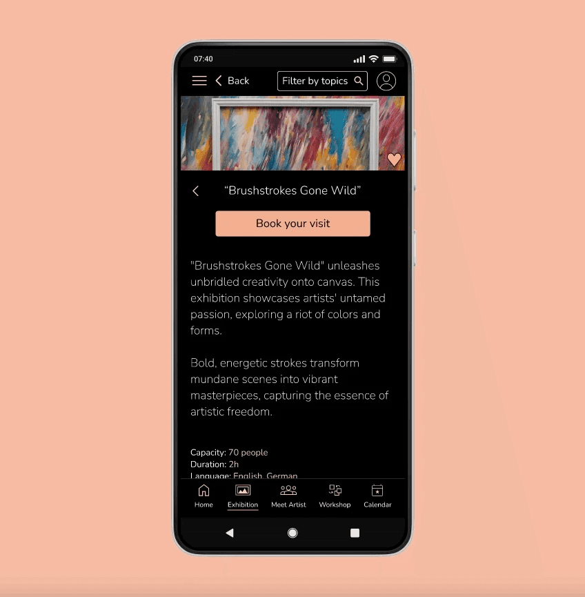
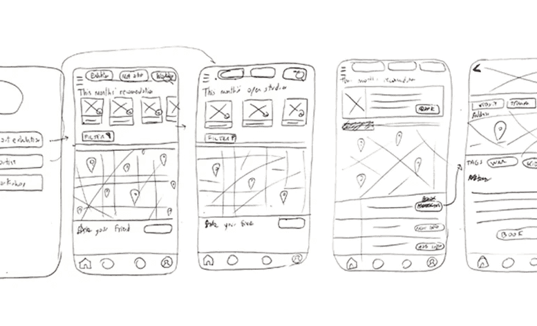
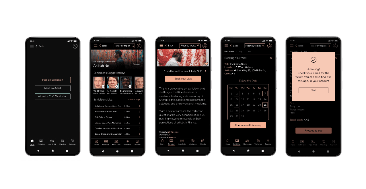
After extended wireframing, I created a low-fidelity prototype, developing the main user flow considering 3 features:

  • one for booking an exhibition

  • one for attending a workshop

  • one to meet an artist

In this phase, I also started drafting a first version of the design system, which will certainly become handy in the future, in times of new implementations.

04

Testing

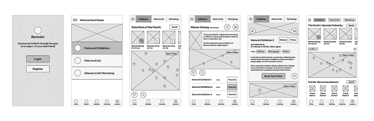
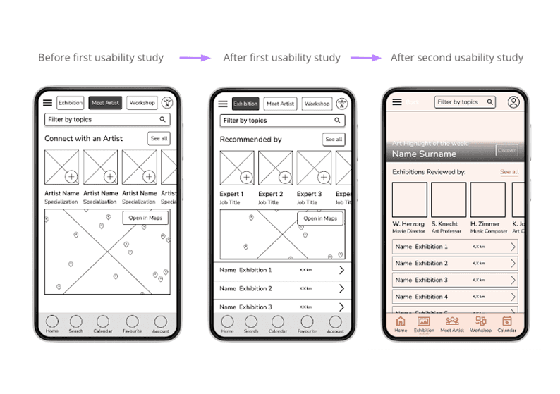
Once the low-fi prototype was ready, I conducted a usability study, collecting 6 findings. Here’s one: "Users needed a better distribution of the main content on the home page: the list of exhibitions."

Following the second usability study, it also became evident that certain users encountered difficulties with the booking flow. Consequently, additional steps were introduced to streamline the process and improve the user experience, for example adding extra confirmation steps,

05

Re-design

As the features of the app were not clearly displayed, to increase the chances of users subscribing at the end of the onboarding process, I’ve added 3 extra introduction screens about them. On top of that, after reading them some users might be more willing to give their consent and generally more secure about their data privacy, which is requested on the screen that follows.

06

Testhing phase N.2

Last but not least, a GIF containing the complete onboarding flow I designed.

Will it pass the mother’s test?


If you don't ask your mother/grandmother to test your product, you haven't finished your job. 

Will it pass the mother’s test?


If you don't ask your mother/grandmother to test your product, you haven't finished your job. 

Last but not least, a GIF containing the complete onboarding flow I designed.

07

Conclusion

The Impact

The Impact

Thanks to iterative improvements following the usability study, all the pain points identified at the project's outset were successfully addressed and resolved.

As evidenced by the survey findings, the majority of users found the re-designed process enjoyable and are inclined to sign up for the app, fulfilling the primary objective of effective onboarding.

What I learned

With this project, I had the opportunity to test many different UX and UI principles an onboarding flow can have. It is indeed a crucial phase, where users don’t know the app and yet they are asked to give consent, share sensitive data, and even sign up for a paid plan. How can we turn this delicate phase into a smooth, informative, and reassuring experience for them?

Behind the abundance of UX solutions available, I've come to appreciate the vital role of self-questioning for UX designers regarding bias, inclusivity, accessibility, and ethicality. These reflections have guided me, for example, to prioritize user privacy by minimizing sensitive questions and providing explanations to justify them. These principles not only enhance the user experience but also foster trust and respect, ultimately contributing to the creation of more ethical and inclusive design solutions.

07

Conclusion

The Impact

Thanks to iterative improvements following the usability study, all the pain points identified at the project's outset were successfully addressed and resolved.

As evidenced by the survey findings, the majority of users found the re-designed process enjoyable and are inclined to sign up for the app, fulfilling the primary objective of effective onboarding.

What I learned

With this project, I had the opportunity to test many different UX and UI principles an onboarding flow can have. It is indeed a crucial phase, where users don’t know the app and yet they are asked to give consent, share sensitive data, and even sign up for a paid plan. How can we turn this delicate phase into a smooth, informative, and reassuring experience for them?

Behind the abundance of UX solutions available, I've come to appreciate the vital role of self-questioning for UX designers regarding bias, inclusivity, accessibility, and ethicality. These reflections have guided me, for example, to prioritize user privacy by minimizing sensitive questions and providing explanations to justify them. These principles not only enhance the user experience but also foster trust and respect, ultimately contributing to the creation of more ethical and inclusive design solutions.

Let’s
Connect

©

Elena Leone

2024

Let’s
Connect

©

Elena Leone

2024

Let’s
Connect

©

Elena Leone

2024