This is a study project worth sharing. I'm going take you through all the usual steps that you would expect a UX designer to know, so you won't mistake me for a rogue AI trying to take over the design world.
ART.BE is an app designed for artists and art lovers living in Berlin. It serves as a platform to connect these two groups through exhibitions, workshops, and open studio events.
September - November 2023
UX and UI, designing the app from conception to delivery.
Interviewing users for research, crafting paper and digital wireframing, low and high-fidelity prototyping, conducting two usability studies, initiating testing on accessibility, and iterating on designs.
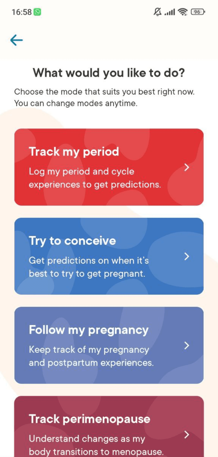
UX Pain Points
Onboarding progress duration unclear
User flow interrupted for consent solicitation
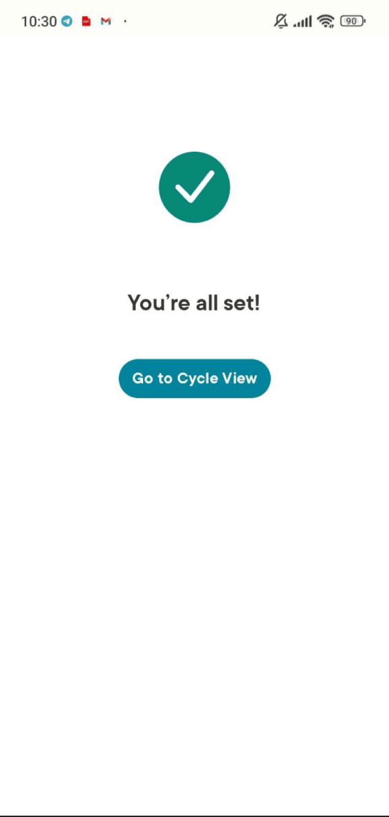
Post-onboarding confirmation lacks consistency
Premium account benefits poorly displayed on the promo page
Home screen prioritizes promo banner over tracker tool
UI Pain Points
User flow interrupted for consent solicitation
Post-onboarding confirmation lacks consistency
Premium account benefits poorly displayed on the promo page
Home screen prioritizes promo banner over tracker tool
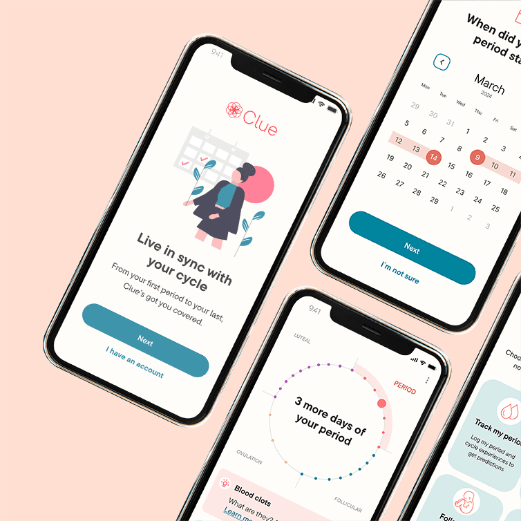
Clue Original Onboarding
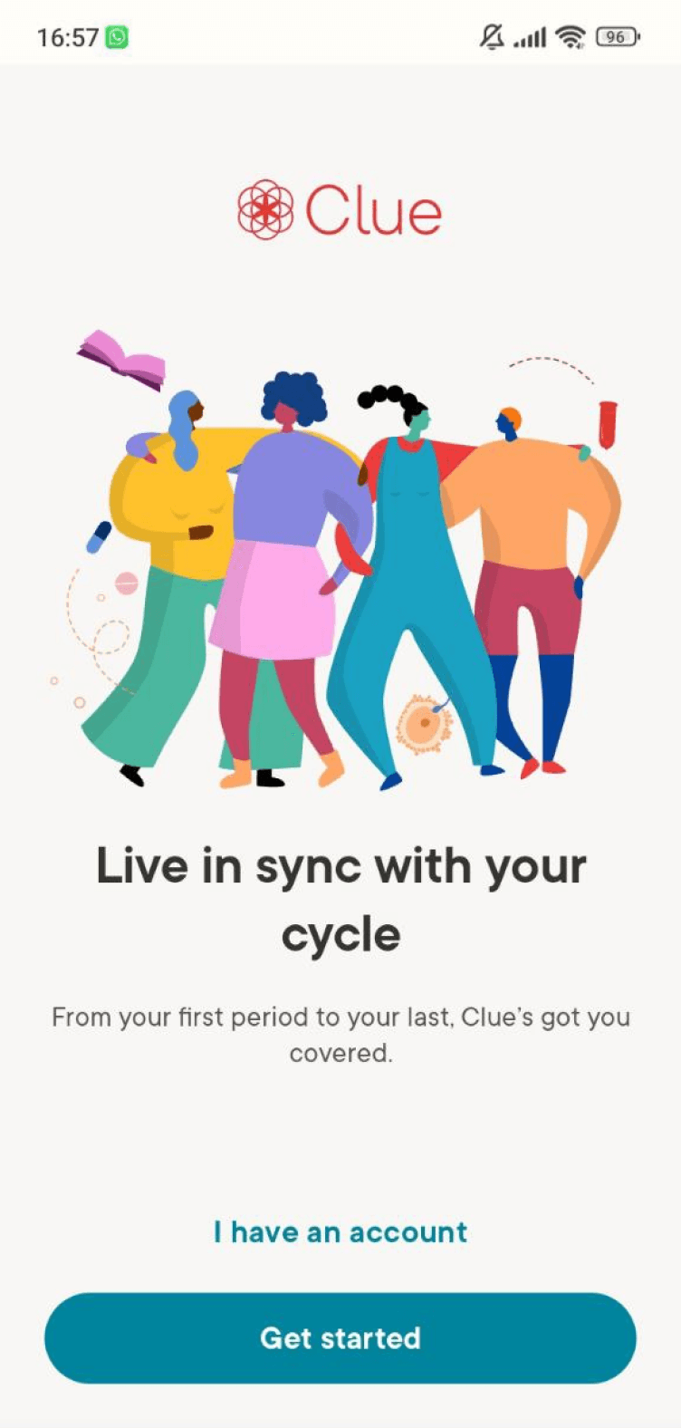
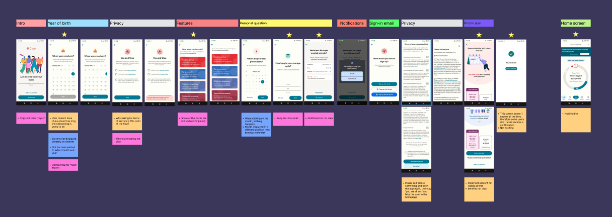

Before
Not all features are fully visible, users need to scroll
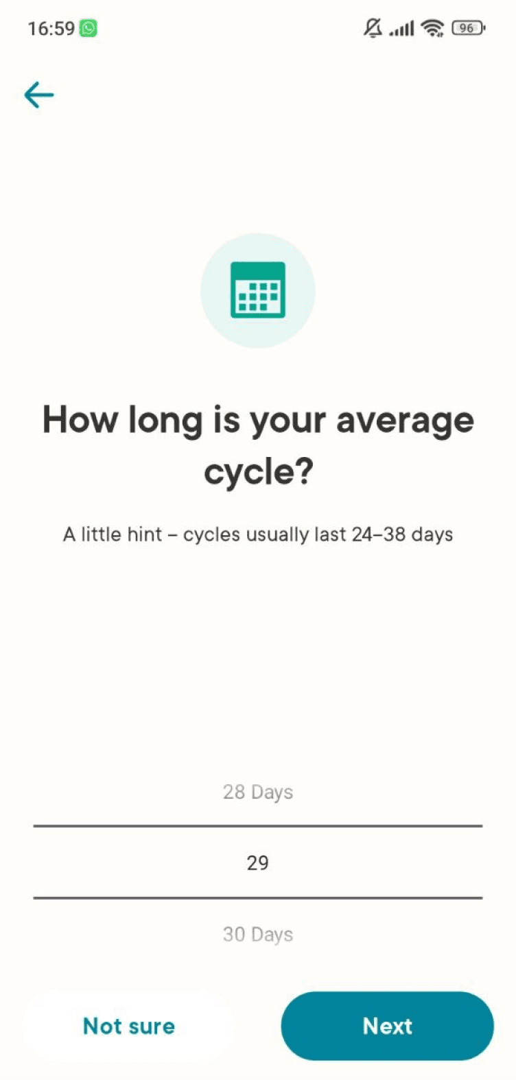
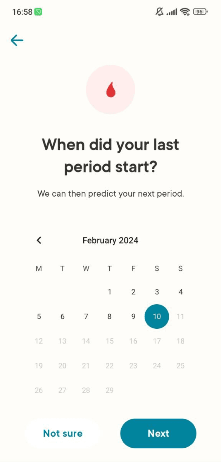
Selecting manually day, month, and year can require quite some time
The background color of some boxes doesn't follow WCAG standards
After
All the boxes are visible and the copy is more readable
The icons support users in understanding what the features are about
An extra confirmation step has been added, to show the users what had been selected before proceeding

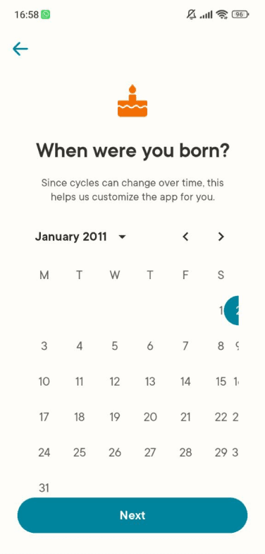
Before
Not all the buttons are visible (on Android)
Selecting manually day, month, and year can require quite some time
After
The input format is more intuitive
The pre-filled example helps users who are not familiar with this format understand what to do
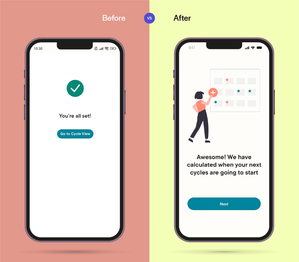
Before
The copy appears generic
Not visually engaging
After
More information has been added to explain what’s the current status
A subtle animation was implemented in the background, to entertain users as they wait for the next screen to load
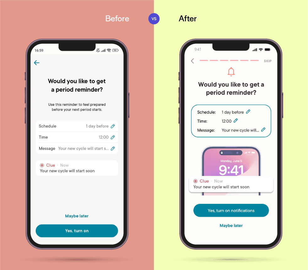
Before
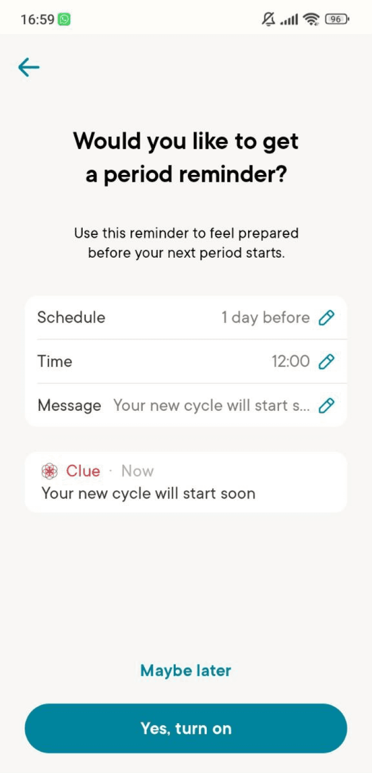
The notification preview appears so realistic that some users might thing their period is about to start and not understand that it's just a sample
The notification set up is not engaging
After
The notification preview is clearly separate from the standard content
The preview appears to be less realistic because it's on top of a phone, yet easy to understand
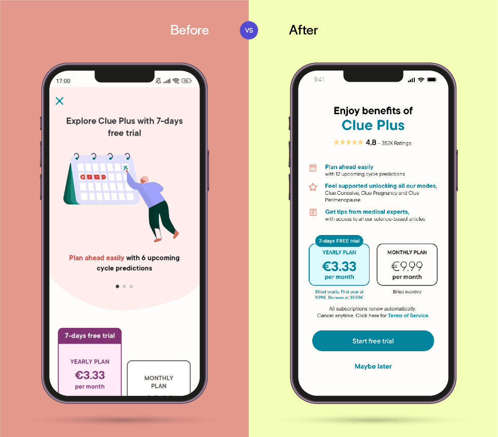
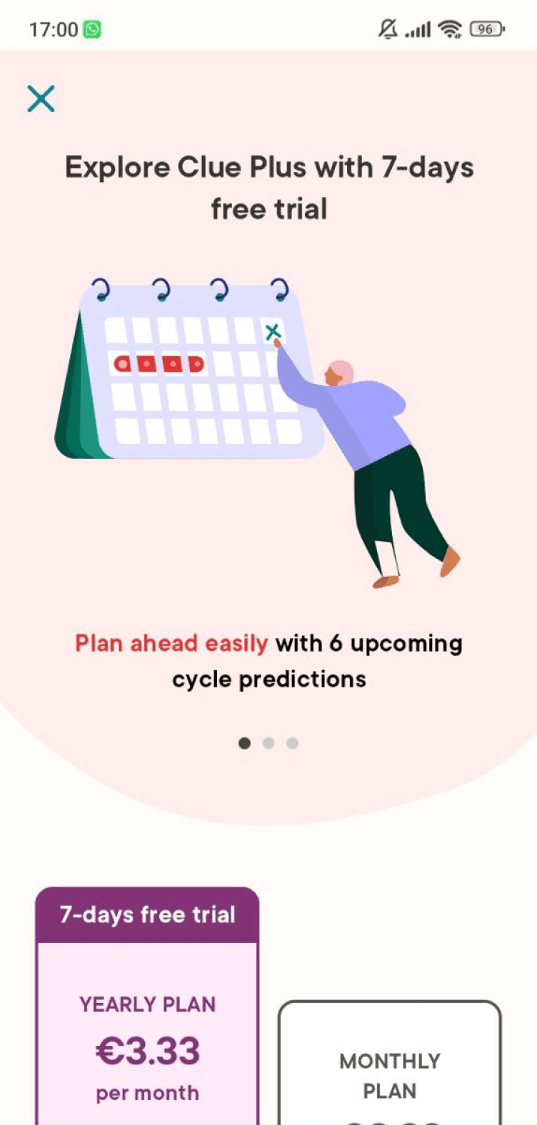
Before
The benefits are not immediately displayed, and some users might completely skip them while scrolling
Important content is not visible without scrolling
Some users might struggle to exit this page once they scroll down
After
The main benefits are listed clearly on top of CTA buttons
Added "Maybe later" as a more visible alternative to "X" button
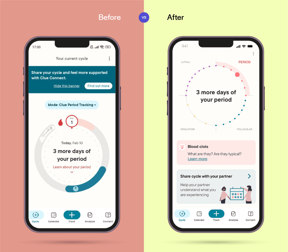
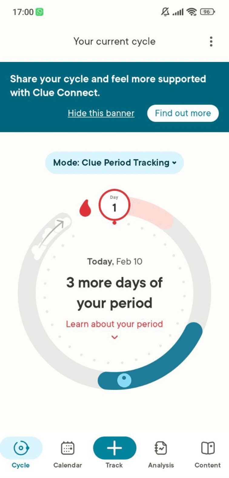
Before
The promo banner placed before main tools could lead to frustrating interactions
The tracking wheel lacks intuitiveness without a tutorial
After
The main tool is now prioritized and accompanied by additional information
An informative button appears below, to engage more with users and give them extra insight about their period
The promo banner, at the bottom of the screen, is now less intrusive
Especially when working on the UI, accessibility has been one of my main priorities. This includes ensuring the following:
Contrast between text and background was high enough to pass the WCAG test
There were both icons and text to help make navigation more understandable
Ultimately, once all mockups were updated, I finally designed high-fidelity prototypes, also known as the rediscovering-yourself-as-a-traffic-engineer phase. Keeping a consistent flow for each feature selected (between "Booking an exhibition", "Workshop", or "Meeting an artist"), the result is a clear and easy-to-use app.
The app was updated accordingly with the last findings, and here you can have a peek at the final look: