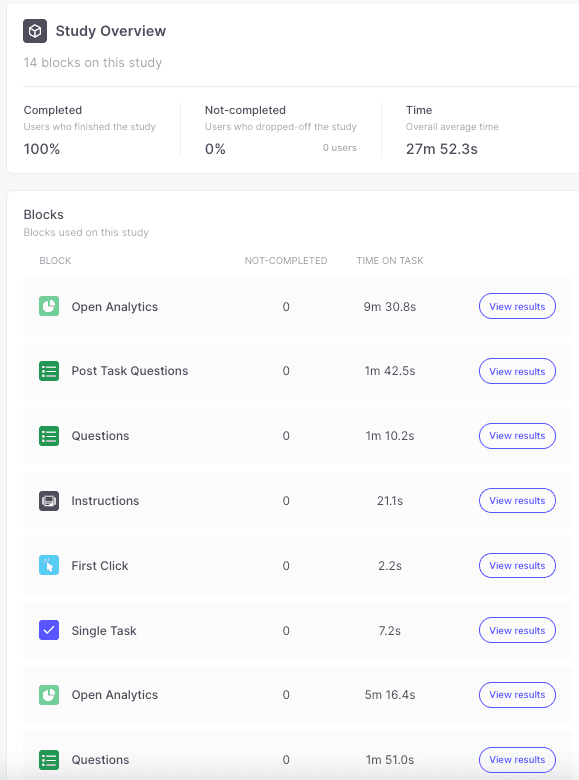
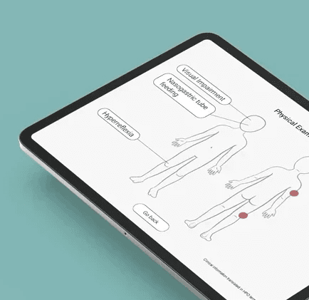
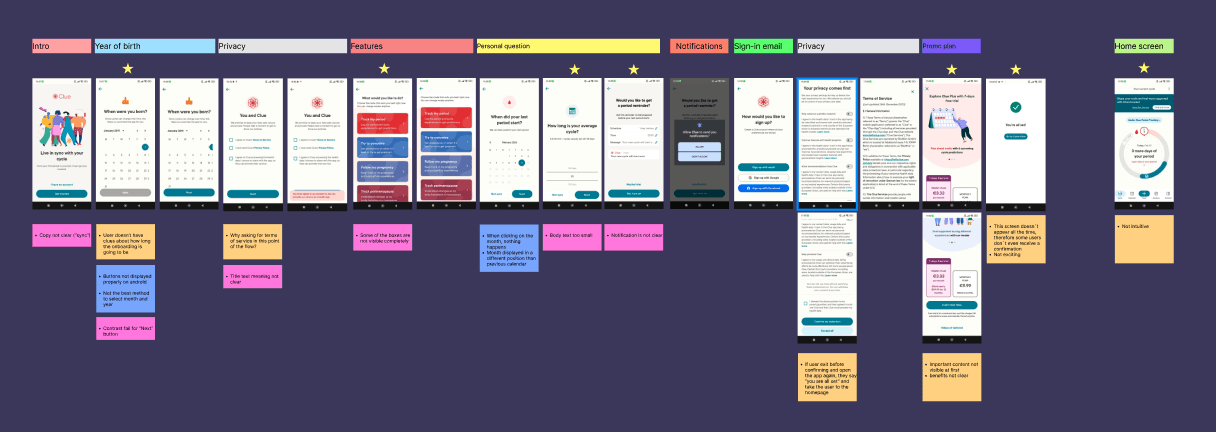
Centogene, a renowned global leader in genetic diagnostics where I was employed for six years, was searching for strategies to engage with physicians visiting their booth at conferences. Recognizing this opportunity, I pitched an innovative solution and assumed the role of project leader to spearhead its implementation. Collaborating closely with my team, we created a captivating text-adventure game, which not only could generate more leads, but also significantly raise awareness regarding the importance of genetic testing. Below, you'll find a glimpse of the draft version we crafted.
Text adventure game with multiple choices, designed for physicians and medical students.
The experience typically spans 2-5 minutes and is showcased on tablets positioned at standing stations within conference booths.
Visual Designer, 2017 - 2023
Project leader, UX, UI, Booth designer
Ideation of the whole game concept, pitch presentations, project leader coordinating a team which included medical advisors, a copywriter and developers, and creating low-fidelity prototype for handover to the development team.
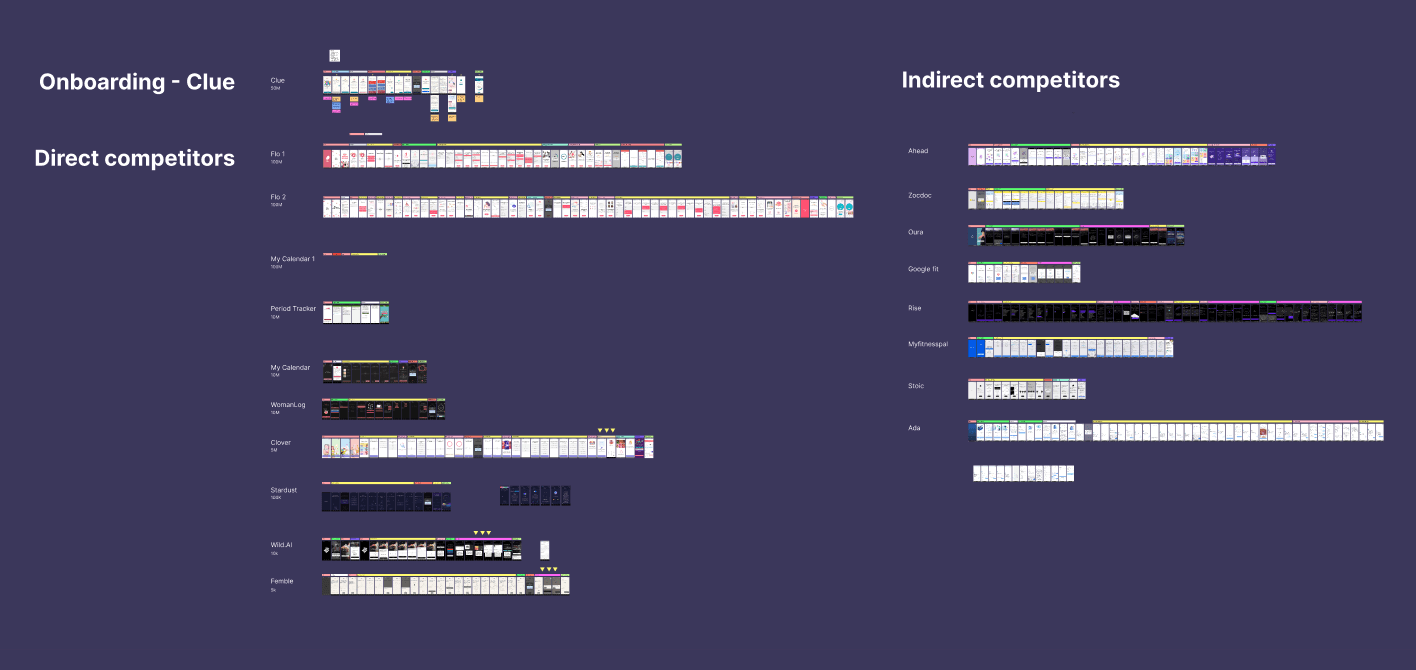
UX Pain Points
Onboarding progress duration unclear
User flow interrupted for consent solicitation
Post-onboarding confirmation lacks consistency
Premium account benefits poorly displayed on the promo page
Home screen prioritizes promo banner over tracker tool
UI Pain Points
User flow interrupted for consent solicitation
Post-onboarding confirmation lacks consistency
Premium account benefits poorly displayed on the promo page
Home screen prioritizes promo banner over tracker tool
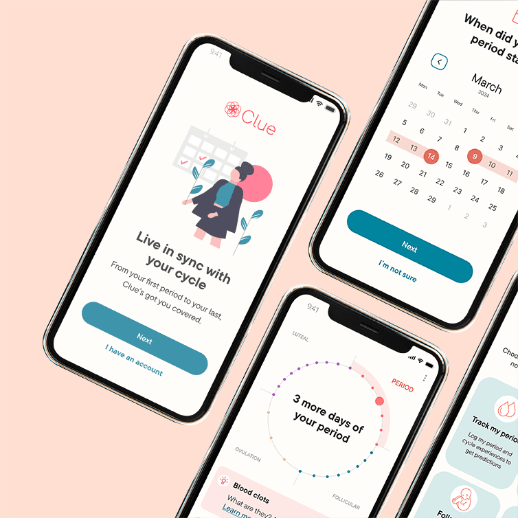
Clue Original Onboarding
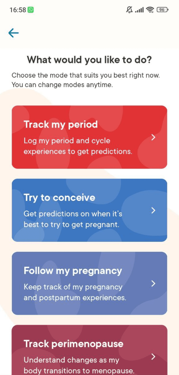

Before
Not all features are fully visible, users need to scroll
Selecting manually day, month, and year can require quite some time
The background color of some boxes doesn't follow WCAG standards
After
All the boxes are visible and the copy is more readable
The icons support users in understanding what the features are about
An extra confirmation step has been added, to show the users what had been selected before proceeding

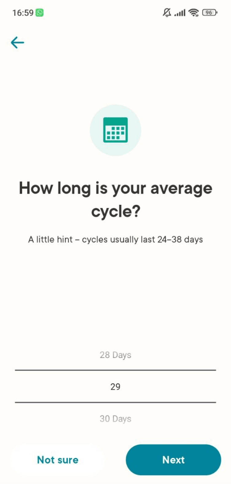
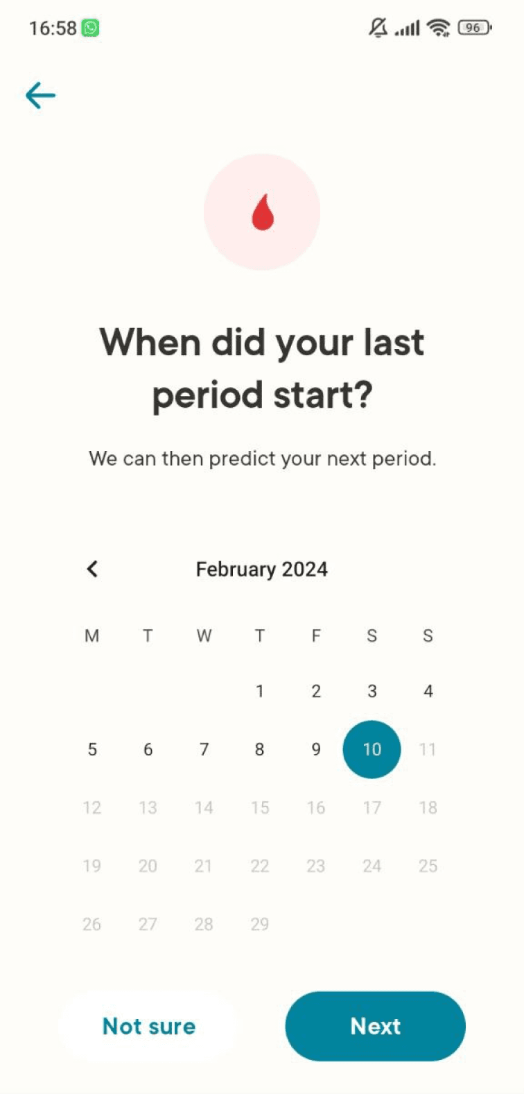
Before
Not all the buttons are visible (on Android)
Selecting manually day, month, and year can require quite some time
After
The input format is more intuitive
The pre-filled example helps users who are not familiar with this format understand what to do
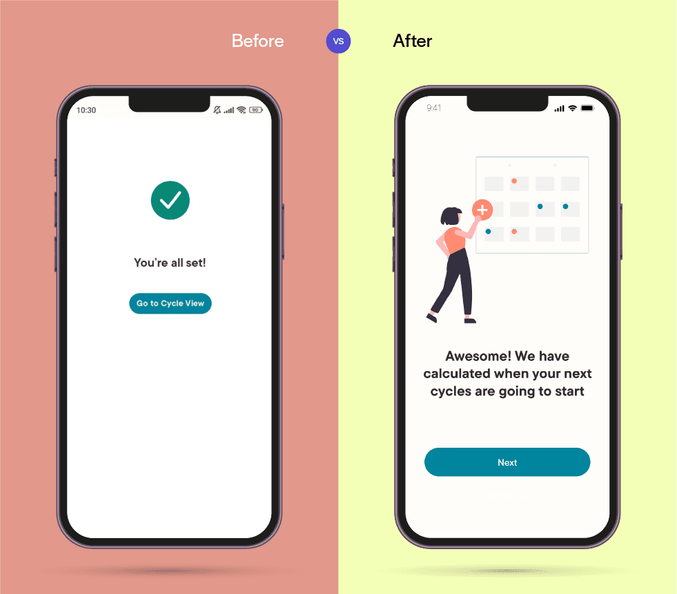
Before
The copy appears generic
Not visually engaging
After
More information has been added to explain what’s the current status
A subtle animation was implemented in the background, to entertain users as they wait for the next screen to load
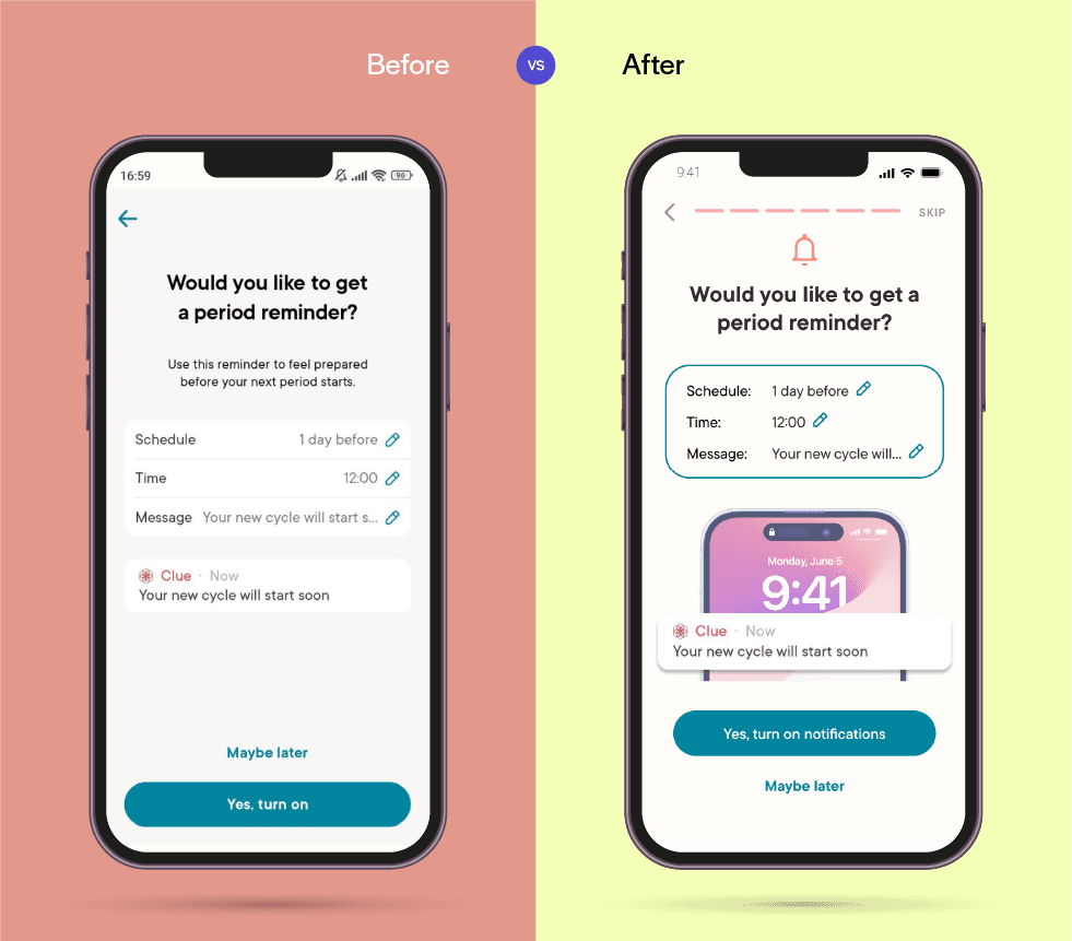
Before
The notification preview appears so realistic that some users might thing their period is about to start and not understand that it's just a sample
The notification set up is not engaging
After
The notification preview is clearly separate from the standard content
The preview appears to be less realistic because it's on top of a phone, yet easy to understand
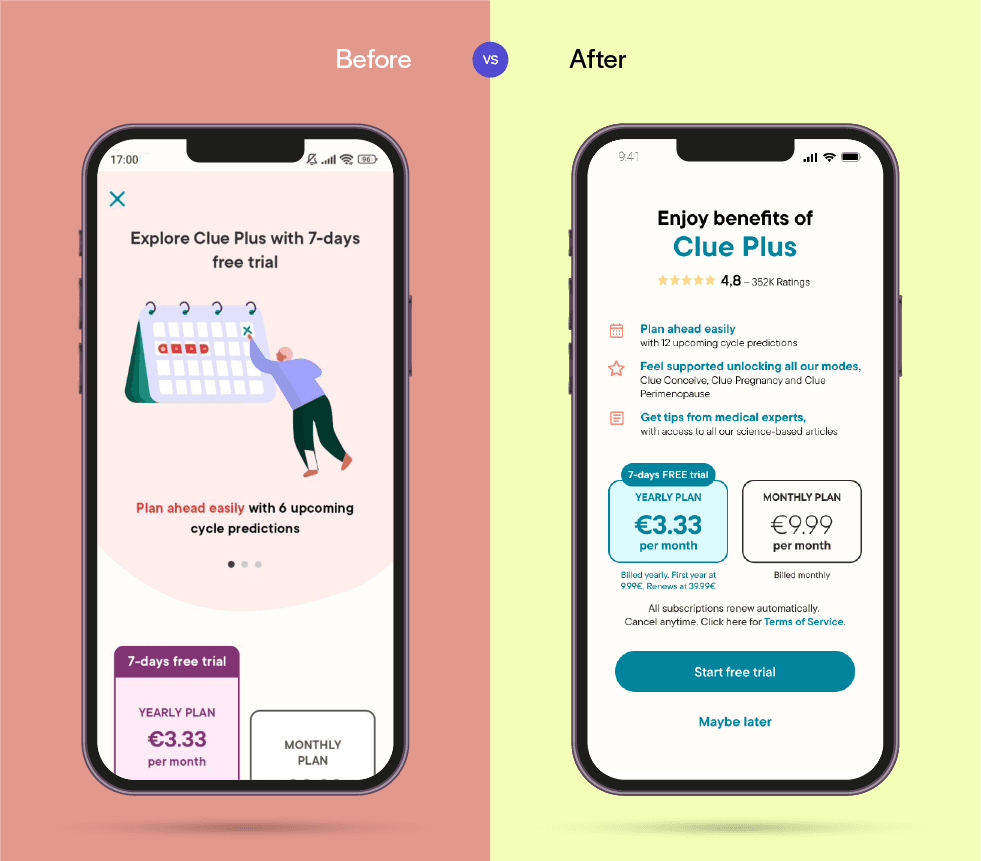
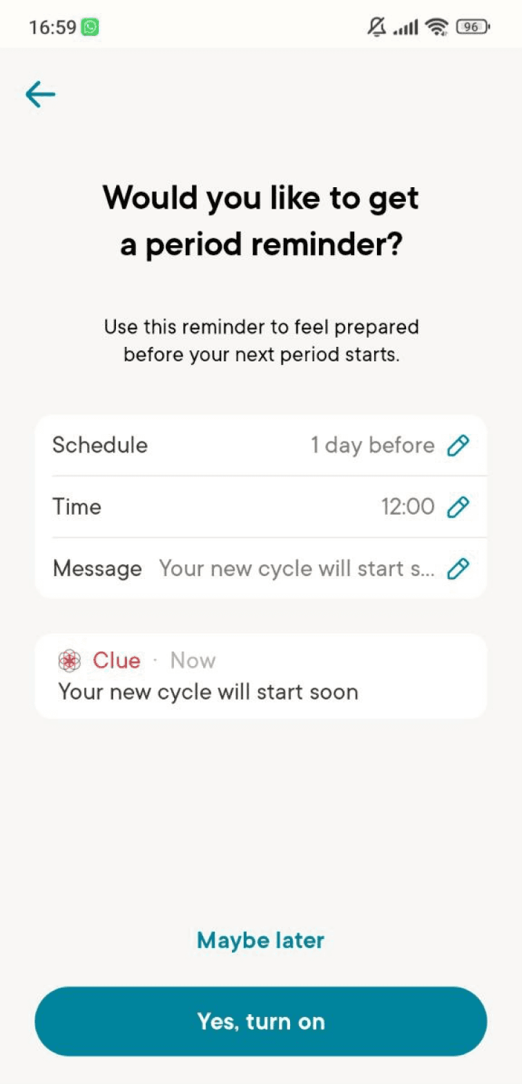
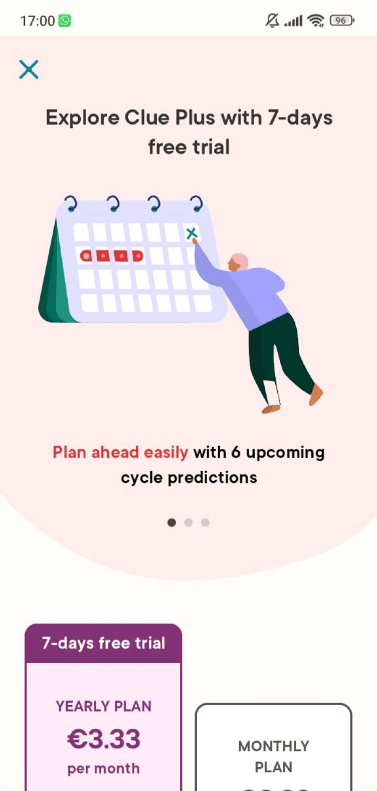
Before
The benefits are not immediately displayed, and some users might completely skip them while scrolling
Important content is not visible without scrolling
Some users might struggle to exit this page once they scroll down
After
The main benefits are listed clearly on top of CTA buttons
Added "Maybe later" as a more visible alternative to "X" button
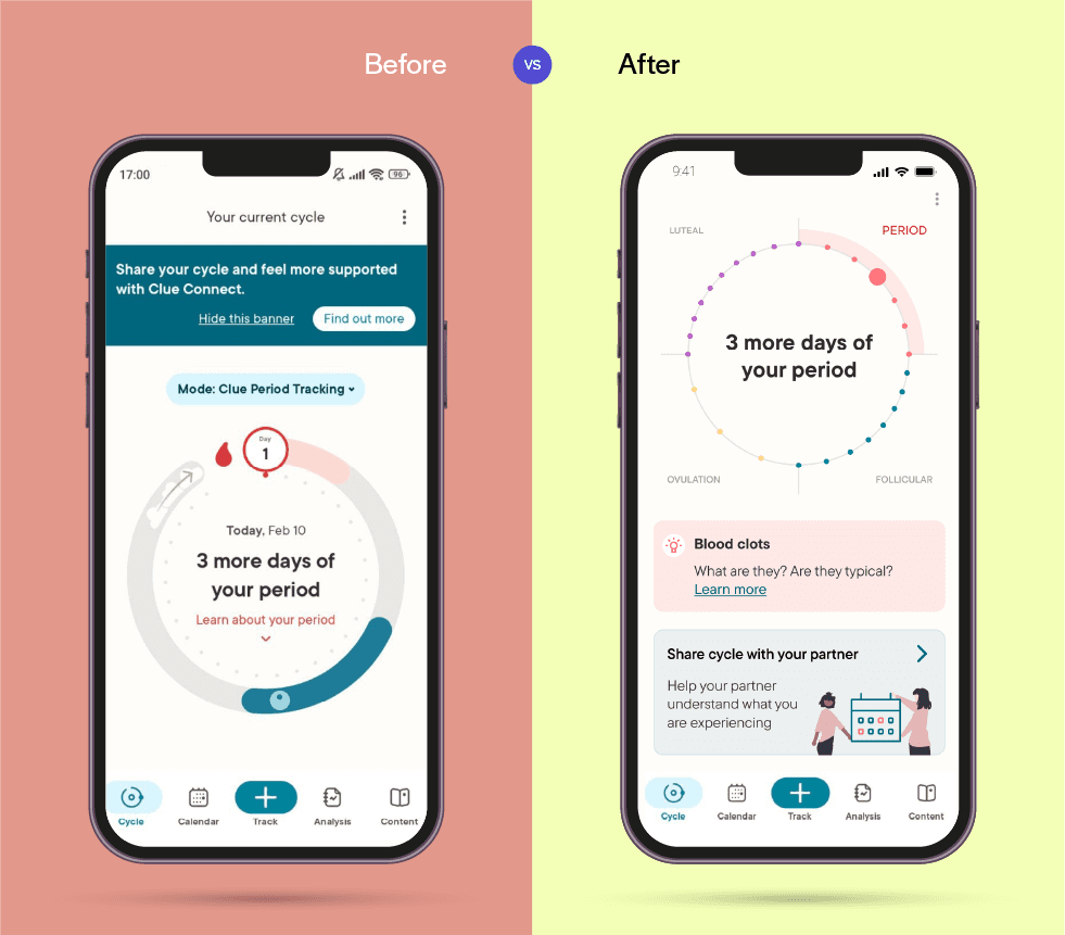
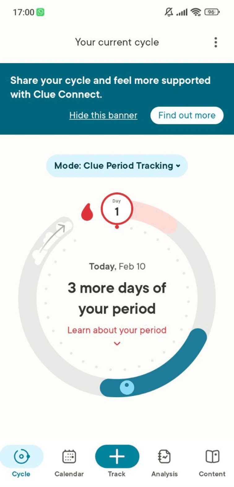
Before
The promo banner placed before main tools could lead to frustrating interactions
The tracking wheel lacks intuitiveness without a tutorial
After
The main tool is now prioritized and accompanied by additional information
An informative button appears below, to engage more with users and give them extra insight about their period
The promo banner, at the bottom of the screen, is now less intrusive